Quantcast
Channel: ComponentSource News | Data Editor Components
Viewing all 2496 articles
Browse latest View live

Telerik DevCraft UI R3 2020

$
0
0
Telerik DevCraft UI

Adds 45+ new components, improvements in Blazor and WinUI, and support for .NET 5, Angular 10 and Vue 3.0.

Features

Telerik DevCraft UI includes the following updates:


Kendo UI R3 2020

$
0
0
New components in Kendo UI R3 2020.

Adds new Loader, AppBar, TextArea and ImageEditor components, and improves Chart, Form, Grid and more.

Features

  • Common
    • New Loader component.
    • New AppBar component.
    • New TextArea component.
    • New ImageEditor component.
  • Chart
    • Chart legend title.
    • Allow labels to be applied to plotbands.
    • Missing median and mean settings for box plot series.
  • Form
    • Form label encoded option.
  • Gantt
    • Replace Gantt custom treelist implementation with the actual TreeList component.
    • Gantt column options.
    • Planned vs. Actual.
    • Column Templates.
    • fix(gantt): use toolbar styles for gantt.
  • Grid
    • Expanding all detail templates via expandRow() on a Grid with many records and no paging enabled is slow.
    • Sticky Columns.
  • ListView
    • Change ListView role when selection is not enabled.
  • NumericTextBox
    • NumericTextBox select on focus.
  • PivotGrid
    • PivotGrid row and column header sorting.
  • TreeList
    • Include drag and drop to reorder items in TreeList.
    • Selection checkbox column for TreeList widget.

Fixes

  • Chart
    • ExportImage is not saving the chart image in the desired dimensions in HiDPI.
    • RadarLine with missingValues.interpolate does not connect end and start points.
  • Chat
    • JS error "Cannot use 'in' operator to search for 'buttons' in false" when .setOptions({toolbar:false}) is called.
  • DateRangePicker
    • On Android the DateRangePicker change event close Calendar after selecting a Start Date.
  • DateTimePicker
    • componentType does not apply "modern" in mvvm.
  • Diagram
    • Missing e.meta in click handler of a Diagram shape.
  • Editor
    • Focus gets stuck when navigating through color pickers tools using the keyboard in editor toolbar.
    • Editor - empty em tags remain after clearing the content.
    • Editor placed in a Window forces a request to undefined endpoint.
    • Improve initial content deserialization.
  • Form
    • Form setOptions does not detach event handlers correctly.
  • Gantt
    • Wrong Gantt Milestone timeline position in LESS themes.
    • No styles for focused items in Scheduler and Gantt headers in Material, Material Black, Fiori.
    • Not properly sized resizable columns in Gantt's TreeList view on less than 480px screen width.
  • Grid
    • Page is not reset after grouping.
    • Persist selection does not work with group paging.
    • Incorrect Grid "items" count when groupPaging is set to true.
    • Grid autoFitColumn method does not work correctly with column filter and column menu.
    • ColumnMenu in grid hides wrong columns and JS error appears when column without title is placed first.
    • Group paging does not work correctly with local data.
    • Setting pageable.position to "top" moves Grid's footer at the top of the component.
    • Detail rows are partially exported in PDF.
    • AutoFitColumn in multi-columns headers grid with locked column is not working.
    • Wrong cell editors when Column Virtualization is used with Locked columns.
  • ListView
    • Listview broken when initialized from table due to new rendering.
  • MaskedTextBox
    • Validation labels are not colored properly when reset method is called.
  • Menu
    • Menu sub-menus do not open on hover, if their parent root item with openOnClick is expanded through the expand icon.
  • NumericTextBox
    • Validation labels are not colored properly when reset method is called.
  • PDF Export
    • Detail rows are partially exported in PDF.
  • Pager
    • Responsive pager is rendered when the width is more than the boundary.
  • Rating
    • Rating label shows incorrect value with half precision.
  • Scheduler
    • No styles for focused items in Scheduler and Gantt headers in Material, Material Black, Fiori.
  • Spreadsheet
    • Javascript exception on loading a file in the Spreadsheet.
    • Unable to add a new row to a sheet exported to Microsoft Excel and imported back in Spreadsheet.
    • Spreadsheet: Incorrect server-side import of Microsoft Excel file with frozen panes.
    • Wrong values copied from Spreadsheet, if cells are selected via keyboard and the data range exceeds the non-scrolling size of the Spreadsheet.
    • Spreadsheet cannot be scrolled in Apple Mac iOS 13.
    • Telerik.web.Spreadsheet.Workbook.Load() throws an error on loading a document with gradient cells' background.
  • TextBox
    • Validation labels are not colored properly when reset method is called.
  • TileLayout
    • Calling setOptions on resize event breaks subsequent resize.
  • TreeList
    • ColumnMenuOpen event not triggered in Kendo UI TreeList.
  • Window
    • Editor placed in a Window forces a request to undefined endpoint.

Telerik DevCraft Complete R3 2020

$
0
0
Telerik DevCraft Complete

Adds 45+ new components, improvements in Blazor and WinUI, and support for .NET 5, Angular 10 and Vue 3.0.

Features

Telerik DevCraft Complete includes the following updates:

Smart HTML Elements v8.0.0

$
0
0
Pivot Table

Adds new Pivot Table and Date Input components.

Features

  • Added new Pivot Table component.
  • Added new Number Input component.
  • Added new Date Input component.
  • Added new Time Input component.
  • Added new ButtonGroup component.
  • Added the ability to use custom sorting in a Table.
  • Added the ability to use new checkbox selection in a Table.
  • Added the ability to use state maintenance in a Table.
  • Added the ability to use Conditional Formatting in a Table.
  • Added the ability to use Localization in a Table.
  • Added the ability to use Edit validation in a Grid.
  • Added the ability to use Add new column in a Grid.
  • Added the ability to use Edit Column Label in a Grid.
  • Added the ability to use Edit Column Description in a Grid.
  • Added the ability to use New Masked Text Editor in a Grid.
  • Added the ability to use Grouping with Paging in a Grid.
  • Added the ability to use Cells Wrap on Demand in a Grid.
  • Added the ability to use Conditional Formatting in a Grid.

BCGSuite for MFC v30.6

$
0
0
Draw text with syntax highlighting

Edit control adds the ability to draw text with syntax highlighting on selected or marked areas.

Features

  • Added WinAppDriver (Microsoft Windows Application Driver) support.
  • Dialogs and Forms
    • CBCGPPropertySheet - Added support for the page swipe gesture.
    • CBCGPPropertySheet - SetActivePageWithEffects method is virtual now.
  • Chart Control
    • CBCGPChartAdvancedFormula - Added new moving average type MA_CUMULATIVE.
    • CBCGPChartAdvancedFormula - Added new methods SetOutputSeriesType and SetOutputSeriesCategory.
    • Added new class CBCGPChartMAENVFormula - Adds "Moving Average Envelopes" for the Stock charts.
    • CBCGPChartMACDFormula - Added 2 result calculation types - VA_MACD - Moving Average Convergence/Divergence Oscillator (current calculation type) and VA_PPO - Percentage Price Oscillator (new).
    • CBCGPChartMACDFormula - Added 2 new methods: SetValueType and GetValueType.
    • CBCGPBaseChartStockSeries::StockSeriesType enumerator has a new member "SST_BAR_HLC".
    • CBCGPChartStockSeries - Added Heikin-Ashi Candlesticks data calculation type.
    • CBCGPChartVisualObject - A new method SetOptimizedDiagramArea allows to optimize diagram's layout after one of axes moves inside/outside the diagram's area.
  • Grid and Report Controls
    • CBCGPGridColumnChooser - this class is exportable now and can be customized according to customer's needs.
    • CBCGPGridCtrl - Added the ability to enable/disable Grid zooming by the mouse wheel (when Ctrl is pressed) or gesture zoom.
    • CBCGPGridCtrl - Added EnableZoom and IsZoomEnabled methods.
    • Added new method CBCGPGridCtrl::SetFilterBarText which allows you to programmatically specify a filter bar content.
  • Controls
    • CBCGPStatic::SetPicture allows to load SVG images now.
    • CBCGPComboBox doesn't redraw itself anymore when control receives CB_SETCURSEL message and WPARAM contains an index of already selected item.
    • CBCGPGroup - Added the ability to hide/show all controls located inside the group.
    • CBCGPDateTimeCtrl - Added touch mode.
    • CBCGPDateTimeCtrl - Added the ability to display a new date/time list popup window when user clicks drop-down button.
    • CBCGPDateTimeCtrl - Added DTM_DROPLIST flag to this control.
    • Added a new class CBCGPDateTimeList which implements a touch-friendly date-time picker.
  • MSAA and CodedUI Tests
    • CBCGPButton - If description (text below label) is specified, get_accDescription method returns this text now.
    • CBCGPCalendar - get_accValue returns a range of selected dates now (if multiple days selection is specified).
    • CBCGPCalendar - Added accessibility support to popup month picker window.
    • CBCGPScrollBar - Improved accessibility support.
    • CBCGPDateTimeCtrl - Improved accessibility support.
  • Edit control
    • Added the ability to draw text with syntax highlighting on selected or marked areas.
    • The following new methods were added to CBCGPEditCtrl class:
      • EnableSyntaxHilightingOnSelection
      • IsSyntaxHilightingOnSelection
      • EnableSyntaxHilightingOnColorLine
      • IsSyntaxHilightingOnColorLine
      • EnableSyntaxHilightingOnHiliteMarkers
      • IsSyntaxHilightingOnHiliteMarkers
    • CBCGPEditCtrl - Added new virtual method OnGoToNextMarker which allows to customize markers navigation behavior.
  • Miscellaneous
    • Added a new class CBCGPTextGaugeCtrl which provides an easy way to add text gauge (CBCGPTextGaugeImpl) to the dialog or form view.
    • All calls to lstrcpy were replaced with StringCchCopy (for Microsoft Visual C++ 2008 or later).
    • CBCGPTagCloud - Added visual manager support.
    • CBCGPTagCloud - Added new methods SetVisualManagerTheme and IsVisualManagerTheme to this class.
    • CBCGPPlannerManagerCtrl - Added vertical scrolling during appointment dragging and time range selection.
    • CBCGPPlannerManagerCtrl - Added new methods EnableDragScroll and IsDragScrollEnabled to this class.
  • Examples and Samples
    • BCGPChartExample - Added demonstration of new stock chart features (SST_BAR_HLC series type and "Heikin-Ashi Candlesticks").
    • BCGPCalendarDemo - Added week number type demonstration.
    • BCGPGanttDemo - Demonstrates usage of new date/time list in the Gantt grid.
    • BCGPGridExample - Demonstrates usage of new date/time list.
    • EditorMarkers - Added demonstration of syntax highlighting inside colored areas.
    • PropSheetDemo - Demonstrates new "Page Swipe Gesture" feature.
    • Added new example BCGPControls.
    • The following samples are not included in the product installation anymore:
      • BreadcrumbDemo
      • CalculatorDemo
      • DateTimeCtrl
      • EditBoxDemo
      • GroupBoxDemo
      • InfoBoxDemo
      • ListBoxDemo
      • TreeCtrlDemo

BCGControlBar Library Professional Edition MFC v30.6

$
0
0
Touch-friendly date-time picker

Adds a new touch-friendly date-time picker.

Features

  • Added WinAppDriver (Microsoft Windows Application Driver) support.
  • Dialogs and Forms
    • CBCGPPropertySheet - Added support for the page swipe gesture.
    • CBCGPPropertySheet - SetActivePageWithEffects method is virtual now.
  • MDI Windows and Tabs
    • CBCGPMDIFrameWnd::EnableWindowsNavigator has a new, optional parameter 'pOptions'. This is a pointer to new CBCGPWindowsNavigatorOptions which allows to customize the Windows Navigator appearance.
    • CBCGPMDITabParams and CBCGPRibbonCaptionMDITabsOptions classes have a new member 'm_InsertedTabPosition' - specifying where new MDI tab is inserted.
  • Tasks Pane and Toolbox
    • CBCGPTasksPane - Added 2 new virtual methods OnBeforeDrawTask and OnAfterDrawTask.
    • CBCGPTasksPane::RemoveAllTasks has a new, optional parameter 'bRedraw'.
  • Chart Control
    • CBCGPChartAdvancedFormula - Added new moving average type MA_CUMULATIVE.
    • CBCGPChartAdvancedFormula - Added new methods SetOutputSeriesType and SetOutputSeriesCategory.
    • Added new class CBCGPChartMAENVFormula - Adds "Moving Average Envelopes" for the Stock charts.
    • CBCGPChartMACDFormula - Added 2 result calculation types - VA_MACD - Moving Average Convergence/Divergence Oscillator (current calculation type) and VA_PPO - Percentage Price Oscillator (new).
    • CBCGPChartMACDFormula - Added 2 new methods: SetValueType and GetValueType.
    • CBCGPBaseChartStockSeries::StockSeriesType enumerator has a new member "SST_BAR_HLC".
    • CBCGPChartStockSeries - Added Heikin-Ashi Candlesticks data calculation type.
    • CBCGPChartVisualObject - Added a new method SetOptimizedDiagramArea which allows you to optimize diagram's layout after one of the axes moves inside/outside the diagram's area.
  • Grid and Report Controls
    • CBCGPGridColumnChooser - This class is exportable now and can be customized according to customer's needs.
    • CBCGPGridCtrl - Added the ability to enable/disable Grid zooming by the mouse wheel (when Ctrl is pressed) or gesture zoom.
    • CBCGPGridCtrl - Added EnableZoom and IsZoomEnabled methods.
    • Added new method CBCGPGridCtrl::SetFilterBarText which allows you to programmatically specify a filter bar content.
  • Controls
    • CBCGPComboBox doesn't redraw itself anymore when control receives CB_SETCURSEL message and WPARAM contains an index of already selected item.
    • CBCGPGroup - Added the ability to hide/show all controls located inside the group.
    • CBCGPEditListBox - Added a new method RemoveAllButtons which removes all edit list buttons.
    • CBCGPTabWnd - Added new tab default position.
    • CBCGPDateTimeCtrl - Added touch mode.
    • CBCGPDateTimeCtrl - Added the ability to display a new date/time list popup window when user clicks drop-down button.
    • CBCGPDateTimeCtrl - Added DTM_DROPLIST flag to this control.
    • Added a new class CBCGPDateTimeList which implements a touch-friendly date-time picker.
  • MSAA and CodedUI Tests
    • CBCGPButton - If description (text below label) is specified, get_accDescription method returns this text now.
    • CBCGPCalendar - get_accValue returns a range of selected dates now (if multiple days selection is specified).
    • CBCGPCalendar - Added accessibility support to popup month picker window.
    • CBCGPPropList - Added accessibility support to commands area (optional list of command links located at control bottom).
    • CBCGPScrollBar - Improved accessibility support.
    • CBCGPTasksPane - Improved accessibility support.
    • CBCGPRibbonPanelMenuBar - Improved accessibility support.
    • CBCGPDateTimeCtrl - Improved accessibility support.
  • Edit control
    • Added the ability to draw text with a syntax highlighting on the selected or marked areas.
    • The following new methods were added to CBCGPEditCtrl class:
      • EnableSyntaxHilightingOnSelection
      • IsSyntaxHilightingOnSelection
      • EnableSyntaxHilightingOnColorLine
      • IsSyntaxHilightingOnColorLine
      • EnableSyntaxHilightingOnHiliteMarkers
      • IsSyntaxHilightingOnHiliteMarkers
    • CBCGPEditCtrl - Added a new virtual method OnGoToNextMarker which allows you to customize markers navigation behavior.
  • Miscellaneous
    • Added a new class CBCGPTextGaugeCtrl which provides an easy way to add text gauge (CBCGPTextGaugeImpl) to the dialog or form view.
    • All calls to lstrcpy were replaced with StringCchCopy (for Microsoft Visual C++ 2008 or later).
    • CBCGPTagCloud - Added visual manager support.
    • CBCGPPlannerManagerCtrl - Added vertical scrolling during appointment dragging and time range selection.
    • CBCGPPlannerManagerCtrl - Added new methods EnableDragScroll and IsDragScrollEnabled to this class.
  • Examples and Samples
    • BCGPChartExample - Added demonstration of new stock chart features (SST_BAR_HLC series type and "Heikin-Ashi Candlesticks").
    • BCGPCalendarDemo - Added week number type demonstration.
    • BCGPGanttDemo - Demonstrates usage of new date/time list in the Gantt grid.
    • BCGPGridExample - Demonstrates usage of new date/time list.
    • BCGPVisualStudioGUIDemo - Added demonstration of syntax highlighting inside selected areas and colored lines.
    • EditorMarkers - Added demonstration of syntax highlighting inside colored areas.
    • Improved example BCGPControls.
    • The following samples are not included in the product installation anymore:
      • BreadcrumbDemo
      • CalculatorDemo
      • DateTimeCtrl
      • EditBoxDemo
      • GroupBoxDemo
      • InfoBoxDemo
      • ListBoxDemo
      • TreeCtrlDemo
    • FrameCaptionDemo and MDITabsDemo - Added demonstration how to specify a new MDI tab position.
    • PropSheetDemo - Demonstrates new "Page Swipe Gesture" feature.

Explore Wijmo's Vue.js 3.0 UI Components

$
0
0
Wijmo Vue Dashboard Demo.

Wijmo's grids, charts, inputs, and gauges are feature-rich, extensible, and fast.

Features

  • Lightweight: Includes high-performance, lightweight datagrid, charts, gauges, and input components.
  • No dependencies: GrapeCity's JavaScript components do not have any external dependencies.
  • Easy-to-read, flexible API: Experience a low learning curve with the API.
  • Extensible: Components have simple cores with as many extensibility points as possible.
  • Familiar: Datagrids and charts are designed with a Microsoft Excel-like experience.
  • Best support: GrapeCity's team offers some of the best support and resources you'll find for Vue.js 2.0 and Vue.js 3.0 components.

Wijmo 2020 v2 (Build 5.20202.732)

$
0
0
Wijmo FlexGrid React demo.

Adds support for React v17.0, plus improvements to FlexGrid and FlexChart components.

Features

  • Adds support for React v17.0.
  • FlexGrid Editing Improvements:
    • Added a showPlaceholders property to display the column header as a placeholder when editing cells. The showPlaceholders property is especially useful in the MultiRow grid and on grids that allow adding new items.
    • Added a KeyAction.CycleEditable setting that causes the grid to move the selection to the next editable column then wraps to the next row. The KeyAction.Cycle Edit setting makes the grid faster to use for users only focused on editing.
  • Globalize - Made the parseFloat method stricter. Before, Globalize.parseFloat would parse strings such as "1 1", "1 + 1", or "foo 1 bar 1" as 11 (remove non-digits, then parse). Now it follows stricter rules and parses strings such as those as NaN (not a number).
  • AutoComplete - Added a beginsWithSearch property to customize the matching behavior. Setting this property to true causes the control to match items that begin with the search term (the default behavior matches items that "contain" the search terms).
  • Calendar Improvements:
    • Added 'weeksBefore' and 'weeksAfter' properties to show additional weeks before and after the current month.
    • Adjusted some CSS rules to make the padding used in calendar items compatible with the padding used in other items (FlexGrid, ListBox, etc.).
  • UndoStack - Added support for paginated data sources.
  • FlexChart - Added new Legend.maxSize property that allows you to specify maximum legend size in pixels (maxSize='50px') or percentages (maxSize='20%').

Syncfusion Essential Studio ASP.NET Core 2020 Volume 3

$
0
0
Redact text and images

Adds the ability to redact text and images from PDF documents.

Features

Common

  • Compatibility support provided for Microsoft .NET 5.0 Release Candidate (RC1).
  • The Kanban component is now marked as a production-ready component for Microsoft ASP.NET Core.

Charts

  • Stacked stepped area chart - A new stacked stepped area chart has been added.
  • Chart legend title - This feature allows you to display a title for a legend.

Diagram

  • Fixed user handle - This feature allows users to add fixed user handles to nodes and connectors.

Word Library

  • Paper source settings - Access and modify the paper source settings in a Microsoft Word document with the FirstPageTray and OtherPagesTray APIs.
  • Shapes in RTF format - Preserve shapes in RTF-to-DOCX conversion and vice versa.
  • Word-to-PDF enhancements
    • Justify the text in a paragraph, like in Microsoft Word 2013.
    • Automatically detect font names from themes for East Asian text.
    • Draw double strike-through and underline styles, like in Microsoft Word.

Word Processor

  • Content control preservation - Preserve the content control in a document opened and exported by the Word Processor.

Data Grid

  • Lazy loading with grouping - This feature allows users to use server-side grouping in order to render records in a collapsed state while binding a large volume of data.
  • Drag and drop frozen rows - This feature allows users to drag and drop grid rows in both frozen and movable parts of the Grid component.

MultiSelect

  • Material Filled MultiSelect - This feature renders the MultiSelect control in filled style, which is the latest material design.

PDF Library

  • Redaction - Redact text and images from PDF documents.
  • PDF417Barcode - Essential PDF now provides support for rendering PDF417Barcode in PDF pages and images.
  • PDF to PDF/A - Convert existing PDF documents to PDF A1B, A2B, A3B conformance.
  • Sign the PDF document externally using hash - Added support to sign the PDF document externally using PDF document hash.
  • Detect blank PDF page - Find empty PDF pages in existing PDF documents.
  • Detect PDF conformance - Detect the PDF conformance of existing PDF document.
  • Annotation import and export - Import and export annotations in JSON format.

Pivot Table

  • Server-side pivot engine - Introduced a server-side engine where all the pivot calculations, filtering, sorting, etc. are done. Then, the information to be displayed in the viewport will be passed to the client side.
  • Inline editing - An option to edit the pivot table value cell directly without the use of an external edit dialog has been provided.
  • Template support in toolbar - Template support to create and add custom toolbar items to the toolbar panel.

Microsoft PowerPoint Library

  • PPTX-to-PDF enhancements
    • Automatically detect font names from themes for complex script and East Asian text.
    • Use an API to define a fallback font for any Unicode character range. This fallback font is used to render characters that do not have glyphs in the original font.

Spreadsheet

  • Picture - Allows users to view, insert, and modify a picture in a spreadsheet with customizing options.
  • Multiline editing - This feature allows users to insert a line break between paragraphs of the text within a cell in a spreadsheet.
  • Range selection helper - Select a range or multiple ranges when editing a formula in a cell.

Stock Chart

  • Stock events for individual series - This feature allows you to give the stock events for each series separately.

Tree Grid

  • Autofill with frozen rows and columns - This feature allows users to drag the autofill icon across frozen and movable parts of the Tree Grid and update the selected cell values in the Tree Grid content.

Microsoft Visual Studio Extensions

  • .NET 5.0 Support - Extended Syncfusion ASP.NET Core Visual Studio Extension by providing the .NET 5.0 support to create Syncfusion ASP.NET Core applications, Angular, and React.

Microsoft Excel Library

  • Excel to PDF enhancements
    • Convert Excel charts with images and shapes to a PDF or image.
    • Convert data bars and color scales of conditional formats to PDF.
    • Convert Excel form controls to PDF AcroForm fields or flattened images.

Syncfusion Essential Studio ASP.NET MVC 2020 Volume 3

$
0
0
Pictures in spreadsheets

Allow users to view, insert, and modify a picture in spreadsheets.

Features

Common

  • The Kanban component is now marked as a production-ready component for Microsoft ASP.NET MVC.

Charts

  • Stacked stepped area chart - A new stacked stepped area chart has been added.
  • Chart legend title - This feature allows you to display a title for a legend.

Diagram

  • Fixed user handle - This feature allows users to add fixed user handles to nodes and connectors.

Word Library

  • Paper source settings - Access and modify the paper source settings in a Microsoft Word document with the FirstPageTray and OtherPagesTray APIs.
  • Shapes in RTF format - Preserve shapes in RTF-to-DOCX conversion and vice versa.
  • Word-to-PDF enhancements
    • Justify the text in a paragraph, like in Microsoft Word 2013.
    • Automatically detect font names from themes for East Asian text.
    • Draw double strike-through and underline styles, like in Microsoft Word.

Word Processor

  • Content control preservation - Preserve the content control in a document opened and exported by the Word Processor.

Data Grid

  • Lazy loading with grouping - This feature allows users to use server-side grouping in order to render records in a collapsed state while binding a large volume of data.
  • Drag and drop frozen rows - This feature allows users to drag and drop grid rows in both frozen and movable parts of the Grid component.

MultiSelect

  • Material Filled MultiSelect - This feature renders the MultiSelect control in filled style, which is the latest material design.

PDF Library

  • PDF417Barcode - Essential PDF now provides support for rendering PDF417Barcode in PDF pages and images.
  • PDF to PDF/A - Convert existing PDF documents to PDF A1B, A2B, A3B conformance.
  • Sign the PDF document externally using hash - Added support to sign the PDF document externally using PDF document hash.
  • Detect blank PDF page - Find empty PDF pages in existing PDF documents.
  • Annotation import and export - Import and export annotations in JSON format.

Pivot Table

  • Server-side pivot engine - Introduced a server-side engine where all the pivot calculations, filtering, sorting, etc. are done. Then, the information to be displayed in the viewport will be passed to the client side.
  • Inline editing - An option to edit the pivot table value cell directly without the use of an external edit dialog has been provided.
  • Template support in toolbar - Template support to create and add custom toolbar items to the toolbar panel.

Microsoft PowerPoint Library

  • PPTX-to-PDF enhancements
    • Automatically detect font names from themes for complex script and East Asian text.
    • Use an API to define a fallback font for any Unicode character range. This fallback font is used to render characters that do not have glyphs in the original font.

Spreadsheet

  • Picture - Allows users to view, insert, and modify a picture in a spreadsheet with customizing options.
  • Multiline editing - This feature allows users to insert a line break between paragraphs of the text within a cell in a spreadsheet.
  • Range selection helper - Select a range or multiple ranges when editing a formula in a cell.

Stock Chart

  • Stock events for individual series - This feature allows you to give the stock events for each series separately.

Tree Grid

  • Autofill with frozen rows and columns - This feature allows users to drag the autofill icon across frozen and movable parts of the Tree Grid and update the selected cell values in the Tree Grid content.

Microsoft Excel Library

  • Excel to PDF enhancements
    • Convert Excel charts with images and shapes to a PDF or image.
    • Convert data bars and color scales of conditional formats to PDF.
    • Convert Excel form controls to PDF AcroForm fields or flattened images.

Syncfusion Essential Studio for JavaScript 2020 Volume 3

$
0
0
Stock events for individual series

Stock Chart adds stock events for individual series.

Features

Common

  • The Kanban component is now marked as a production-ready component for JavaScript.

Charts

  • Stacked stepped area chart - A new stacked stepped area chart has been added.
  • Chart legend title - This feature allows you to display a title for a legend.

Diagram

  • Fixed user handle - This feature allows users to add fixed user handles to nodes and connectors.

Word Processor

  • Content control preservation - Preserve the content control in a document opened and exported by the Word Processor.

Data Grid

  • Lazy loading with grouping - This feature allows users to use server-side grouping in order to render records in a collapsed state while binding a large volume of data.
  • Drag and drop frozen rows - This feature allows users to drag and drop grid rows in both frozen and movable parts of the Grid component.

MultiSelect

  • Material Filled MultiSelect - This feature renders the MultiSelect control in filled style, which is the latest material design.

Pivot Table

  • Server-side pivot engine - Introduced a server-side engine where all the pivot calculations, filtering, sorting, etc. are done. Then, the information to be displayed in the viewport will be passed to the client side.
  • Inline editing - An option to edit the pivot table value cell directly without the use of an external edit dialog has been provided.
  • Template support in toolbar - Template support to create and add custom toolbar items to the toolbar panel.

Spreadsheet

  • Picture - Allows users to view, insert, and modify a picture in a spreadsheet with customizing options.
  • Multiline editing - This feature allows users to insert a line break between paragraphs of the text within a cell in a spreadsheet.
  • Range selection helper - Select a range or multiple ranges when editing a formula in a cell.

Stock Chart

  • Stock events for individual series - This feature allows you to give the stock events for each series separately.

Tree Grid

  • Autofill with frozen rows and columns - This feature allows users to drag the autofill icon across frozen and movable parts of the Tree Grid and update the selected cell values in the Tree Grid content.

Syncfusion Essential Studio for UWP 2020 Volume 3

$
0
0
Shapes in RTF format

Adds the ability to preserve shapes in RTF to DOCX conversion and vice versa.

Features

DataGrid

  • Printing enhancement - Allows users to customize more options of the print dialog. For example, customers can now show the “Custom Range” option to print specific pages, disable print preview of a DataGrid, and more.

Microsoft Word Library

  • Paper source settings - Access and modify the paper source settings in a Word document with the FirstPageTray and OtherPagesTray APIs.
  • Shapes in RTF format - Preserve shapes in RTF-to-DOCX conversion and vice versa.
  • Word-to-PDF enhancements
    • Justify the text in a paragraph, like in Microsoft Word 2013.
    • Automatically detect font names from themes for East Asian text.
    • Draw double strikethrough and underline styles, like in Microsoft Word.

PDF Library

  • PDF417Barcode - Render PDF417Barcode in PDF pages and images.
  • Sign PDF documents externally using hash - Sign PDF documents externally using PDF document hash.
  • Detect blank PDF page - Find empty PDF pages in existing PDF documents.
    • Detect PDF conformance - Detect the PDF conformance of existing PDF documents.
    • Annotation import and export - Import and export annotations in JSON format.

Microsoft PowerPoint Library

  • PPTX-to-PDF enhancements
    • Automatically detect font names from themes for complex script and East Asian text.
    • Use an API to define a fallback font for any Unicode character range. This fallback font is used to render characters that do not have glyphs in the original font.

RichTextBox

  • Word template format - Open and save a document in Word template format (DOT and DOTX).

Microsoft Excel Library

  • Excel to PDF enhancements
    • Convert Excel charts with images and shapes to a PDF or image.
    • Convert data bars and color scales of conditional formats to PDF.
    • Convert Excel form controls to PDF AcroForm fields or flattened images.

Syncfusion Essential Studio WPF 2020 Volume 3

$
0
0
Resource support in Scheduler

Adds resource support in Scheduler control.

Features

Common

  • Designer for Microsoft .NET Core - Microsoft announced the general availability of the new XAML Designer for WPF .NET Core applications and the control designer experience is enhanced with smart tags to provide quick suggestions.
  • Microsoft Office 2019 dark gray, white, and high contrast themes - New Office2019 dark gray, white, black and high contrast themes have been provided for both frameworks and Syncfusion controls.

Step ProgressBar (Preview)

  • The new Step ProgressBar control is used to show the progress of a multi-step process. Customize its appearance by changing the step shape, progress bar color, step template, and content template. Features:
    • Data binding - Bind any business object as the ItemsSource and control the last active item using SelectedIndex.
    • Step shape - The shape of a step marker can be circle or square. Custom templates can also be loaded.
    • Status - Supports active, inactive, and indeterminate statuses to show progress.
    • Orientation - Visualize the progress of a multi-step process in horizontal or vertical orientation.
    • Customization - Customize progress bar styles, markers, and contents using templates.
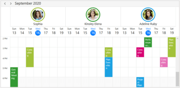
Scheduler (Preview)

  • Resources - This feature allows users to define resources and group appointments based on the resources associated with them in day, week, workweek, and timeline views. You can also customize the resource UI using a template and template selectors.
  • Disable date - This feature allows dates to be disabled when the visible dates exceed the Scheduler’s minimum and maximum date range.
  • Context menu - The Scheduler provides support to define a context menu for appointments, time slots, and month cells. It also features built-in RoutedUICommands support for handling a context menu to add, edit, and delete appointments in the Scheduler.
  • Drag-and-drop support in month view - Drag and drop appointments in the month view when the display mode is set to appointment.
  • Theme support - Material light and dark, Office2019Colorful, and Office2019Black themes have been provided for the Scheduler control.

TreeView

  • Editing - Users can edit the display text of tree nodes.
  • Theme support - Use the Material and Office 2019 themes to adapt the TreeView to the rest of a business application.
  • Horizontal scrolling - Users can scroll the TreeView horizontally to read the content of node properly.
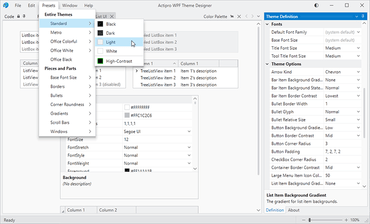
Skin Manager

  • Customize theme colors and font - Modify theme-specific color values and font of themes supported in Theme Studio at the application level.

Ribbon

  • Icon template support for Ribbon items - Add any form of images like path data, font icons, etc. as template to Ribbon items such as DropDownButton, SplitButton, Gallery, RibbonBar, and BackstageCommandButton.
  • Header and footer support for Backstage - Previously, the backstage items could only be placed at the top of the backstage. Now, support has been provided to arrange the backstage items either at the top or bottom.

Diagram

  • Business process model and notation (BPMN) - Business process model and notation (BPMN) is a standard way to represent business processes graphically. You can create a BPMN diagram from code or the visual interface with the built-in BPMN shapes described by the BPMN 2.0 specification.
  • Automatic mind map layout - Create mind map diagrams with a built-in, automatic layout algorithm, which allows you to define which node should be at the center and which nodes should be placed around the center node in the diagram surface automatically.

PDF Library

  • PDF417Barcode - Render PDF417Barcode in PDF pages and images.
  • PDF to PDF/A - Convert existing PDF documents to PDF A2B, A3B conformance.
  • Sign PDF documents externally using hash - Sign PDF documents externally using PDF document hash.
  • Detect blank PDF page - Find empty PDF pages in existing PDF documents.
  • Annotation import and export - Import and export annotations in JSON format.

Microsoft Excel Library

  • Excel to PDF enhancements
    • Convert Excel charts with images and shapes to a PDF or image.
    • Convert data bars and color scales of conditional formats to PDF.
    • Convert Excel form controls to PDF AcroForm fields or flattened images.

Microsoft Word Library

  • Paper source settings - Access and modify the paper source settings in a Word document with the FirstPageTray and OtherPagesTray APIs.
  • Shapes in RTF format - Preserve shapes in RTF-to-DOCX conversion and vice versa.
  • Word-to-PDF enhancements
    • Justify the text in a paragraph, like in Microsoft Word 2013.
    • Automatically detect font names from themes for East Asian text.
    • Draw double strikethrough and underline styles, like in Microsoft Word.

Microsoft PowerPoint Library

  • PPTX-to-PDF enhancements
    • Automatically detect font names from themes for complex script and East Asian text.
    • Use an API to define a fallback font for any Unicode character range. This fallback font is used to render characters that do not have glyphs in the original font.

Property Grid

  • Configure properties manually - You can now stop the auto generation of properties and configure each property manually. You can also configure properties directly in XAML instead of attributes or events.
  • Property description height - Property description panel height can be programmatically set. Auto size, relative size, and absolute size are supported.

DataGrid

  • Text wrapping in combo box columns - Users can wrap the text in combo box columns.

Circular Gauge

  • Rotate labels - Rotate the scale labels based on angle.
    • Dragging events - Use the following events when the user drags the pointer.
    • ValueChangeStarted: Called when the user starts selecting a new value for the pointer by dragging.
    • ValueChanging: Called during a drag when the user is selecting but before there’s a new value for the pointer.
    • ValueChanged: Called when the user is selecting a new value for the pointer by dragging.
    • ValueChangeCompleted: Called when the user is done selecting a new value for the pointer by dragging.

Range Slider

  • Major and minor tick support - Support has been provided to add major and minor ticks in the Range Slider.
  • Active and inactive customizations - Support has been provided for customizing active and inactive ranges.

RichTextBox

  • Word template format - Open and save a document in Word template format (DOT and DOTX).

PDF Viewer

  • Annotation events - Users can track the changes made in annotations, like add, move, resize, and delete.

Carousel

  • Scroll items using scroll bar - You can now scroll items in the Carousel control using horizontal or vertical scroll bars.

ChromelessWindow

  • Hide the maximize and minimize buttons - Options to show or hide minimize and maximize buttons in ChromelessWindow.

Button Controls

  • Icon template - Button controls (ButtonAdv, SplitButtonAdv, DropDownButtonAdv) add support to customize icons using templates. Now, path data, font icons, images, or any UI can be loaded as icons.

AutoComplete (SfTextBoxExt)

  • Clear button support - Support has been provided for including a clear button in tokens.

Color Picker Palette

  • No color button - You can now choose transparent color by clicking a ‘No Color’ button.
  • Selected brush - You can now use SolidColorBrush directly instead of converting from Color to SolidColorBrush. The SelectedBrushChanged event will send notification when color is selected.

HierarchyNavigator

  • Filter support - When in edit mode, suggests matching nodes based on the path entered in the editor like the Microsoft Windows Explorer.

Syncfusion Essential Studio Windows Forms 2020 Volume 3

$
0
0
DataGrid

DataGrid adds MaskEditor column support.

Features

DataGrid

  • Masked edit column - A new column to manipulate the masked text. It provides an easy and reliable way of collecting user input and displaying standard data in specific formats.
  • Set style for cell editor - Allows users to style the editor, which loads on editing, for an elegant look and feel.

Microsoft Word Library

  • Paper source settings - Access and modify the paper source settings in a Word document with the FirstPageTray and OtherPagesTray APIs.
  • Shapes in RTF format - Preserve shapes in RTF-to-DOCX conversion and vice versa.
  • Word-to-PDF enhancements
    • Justify the text in a paragraph, like in Microsoft Word 2013.
    • Automatically detect font names from themes for East Asian text.
    • Draw double strikethrough and underline styles, like in Microsoft Word.

MultiColumnComboBox

  • Custom filtering - Options to search all columns or specific columns in MultiColumnComboBox.

PDF Library

  • PDF417Barcode - Render PDF417Barcode in PDF pages and images.
  • PDF to PDF/A - Convert existing PDF documents to PDF A2B, A3B conformance.
  • Sign PDF documents externally using hash - Sign PDF documents externally using PDF document hash.
  • Detect blank PDF page - Find the empty PDF pages in existing PDF documents.
  • Annotation import and export - Import and export annotations in JSON format.

Microsoft PowerPoint Library

  • PPTX-to-PDF enhancements
    • Automatically detect font names from themes for complex script and East Asian text.
    • Use an API to define a fallback font for any Unicode character range. This fallback font is used to render characters that do not have glyphs in the original font.

Microsoft Excel Library

  • Excel to PDF enhancements
    • Convert Excel charts with images and shapes to a PDF or image.
    • Convert data bars and color scales of conditional formats to PDF.
    • Convert Excel form controls to PDF AcroForm fields or flattened images.

Syncfusion Essential Studio for Xamarin 2020 Volume 3

$
0
0
Convert Excel charts with images and shapes to PDFs

Convert Excel charts with images and shapes to PDFs.

Features

Autocomplete

  • Clear button support - Clear button support has been added to the Autocomplete control when loaded inside the Text Input Layout control.

Busy Indicator

  • Material animation - The Busy Indicator control now features a Material-style animation.

Circular Gauge

  • Image export - Export the circular gauge to a file stream and various image formats.
  • Dragging events - Use the following events when the user drags the pointer:
    • ValueChangeStarted: Called when the user starts selecting a new value for the pointer by dragging.
    • ValueChanging: Called during a drag when the user is selecting but before there’s a new value for the pointer.
    • ValueChanged: Called when the user is selecting a new value for the pointer by dragging.
    • ValueChangeCompleted: Called when the user is done selecting a new value for the pointer by dragging.

ComboBox

  • Clear button support - Clear button support has been provided for the ComboBox control when loaded inside the Text Input Layout control.

Date Picker

  • Date format - The date format dd/MM/yyyy has been added.

Microsoft Word Library

  • Paper source settings - Access and modify the paper source settings in a Word document with the FirstPageTray and OtherPagesTray APIs.
  • Shapes in RTF format - Preserve shapes in RTF-to-DOCX conversion and vice versa.
  • Word-to-PDF enhancements
    • Justify the text in a paragraph, like in Microsoft Word 2013.
    • Automatically detect font names from themes for East Asian text.
    • Draw double strikethrough and underline styles, like in Microsoft Word.

Image Editor

  • Hide the delete icon button - Hide or show the delete icon button in the Image Editor.
  • Color palette circle size - Customize the color palette circle size.
  • Zoom level - Zoom images programmatically.

Maps

  • Tap and pan events - New events when tapping and panning a map to draw and edit shapes.
  • Bring selected marker to top - Bring a selected map marker above all the other markers.

Masked Entry

  • Cursor position and position changing event - Set the cursor position for the Masked Entry control and use a new event that provides notification of cursor position changes.

PDF Library

  • PDF417Barcode - Render PDF417Barcode in PDF pages and images.
  • Sign PDF documents externally using hash - Sign PDF documents externally using PDF document hash.
  • Detect blank PDF page - Find empty PDF pages in existing PDF documents.
  • Detect PDF conformance - Detect the PDF conformance of existing PDF documents.
  • Annotation import and export - Import and export annotations in JSON format.

Microsoft PowerPoint Library

  • PPTX-to-PDF enhancements
    • Automatically detect font names from themes for complex script and East Asian text.
    • Use an API to define a fallback font for any Unicode character range. This fallback font is used to render characters that do not have glyphs in the original font.

Border

  • Border thickness - Use the border thickness property to set the width of an element’s four borders.

DataGrid

  • Swipe all rows - Swipe all rows (table summary, group summary, caption summary, unbound) except header rows.

Rich Text Editor

  • Insert HTML text - Insert HTML text or raw text at the current cursor position.
  • Toolbar position - Switch the position of a toolbar to the top or bottom of the screen.

Tabbed View

  • UI virtualization - Loading the UI on demand to the view in Tabbed View control.

TreeMap

  • Multi-level support for hierarchical collection data - Users can display multiple-level tree map nodes when using a hierarchical data collection.

Microsoft Excel Library

  • Excel to PDF enhancements
    • Convert Excel charts with images and shapes to a PDF or image.
    • Convert data bars and color scales of conditional formats to PDF.
    • Convert Excel form controls to PDF AcroForm fields or flattened images.

Syncfusion Essential Studio for Blazor 2020 Volume 3

$
0
0
TreeGrid adds support for virtual scrolling

TreeGrid adds support for virtual scrolling.

Features

Common

  • There is now Microsoft .NET 5.0 Release Candidate (RC1) compatibility support for Syncfusion’s Blazor components.
  • The following components have been developed to meet industrial standards. They are now marked as production-ready components for Blazor:
    • Kanban.
    • Spinner.
    • Menu Bar.
    • Context Menu.
    • Progress Button.
    • Query Builder.
    • DateTime Picker.

Diagram

  • Fixed user handle - This feature allows users to add fixed user handles to nodes and connectors.
  • Microsoft Word Library
  • Paper source settings - Access and modify the paper source settings in a Word document with the FirstPageTray and OtherPagesTray APIs.
  • Shapes in RTF format - Preserve shapes in RTF-to-DOCX conversion and vice versa.
  • Word-to-PDF enhancements
    • Justify the text in a paragraph, like in Microsoft Word 2013.
    • Automatically detect font names from themes for East Asian text.
    • Draw double strikethrough and underline styles, like in Microsoft Word.

Word Processor

  • Content control preservation - Preserve the content control in a document opened and exported by the Word Processor.

Data Grid

  • WebAssembly Performance improvements
    • Selection.
    • Column Resizing.
    • Filtering.
    • Editing.
    • Row drag and drop.
    • Column Chooser.
    • Column Menu.
    • Toolbar.
    • Column Menu–SubMenu filter.

MultiSelect

  • Material Filled MultiSelect - This feature renders the MultiSelect component in filled style, which is the latest material design.

PDF Library

  • PDF417Barcode - Render PDF417Barcode in PDF pages and images.
  • Sign PDF documents externally using hash - Sign PDF documents externally using PDF document hash.
  • Detect blank PDF page - Find empty PDF pages in existing PDF documents.
  • Detect PDF conformance - Detect the PDF conformance of existing PDF documents.
  • Annotation import and export - Import and export annotations in JSON format.

Microsoft PowerPoint Library

  • PPTX-to-PDF enhancements
    • Automatically detect font names from themes for complex script and East Asian text.
    • Use an API to define a fallback font for any Unicode character range. This fallback font is used to render characters that do not have glyphs in the original font.

Tree Grid

  • WebAssembly Performance improvements
    • Selection.un.
    • Column Resited staizing.
    • Filtering.
    • Editing.
    • Row drag and drop.
    • Column Chooser.
    • Column Menu.
    • Toolbar.
    • Column Menu–SubMenu filter.
  • Row drag and drop - Support to drag and drop tree grid rows within the Tree Grid control, another Tree Grid control, or any custom component to change row positions dynamically in the UI.
  • Virtual scrolling - This feature allows the user to load large amounts of data without performance degradation. It is an alternate way of paging in which the data will load while scrolling vertically.
  • Support for ExpandoObject type data - Provides support to bind ExpandoObject type data to Tree Grid, which is helpful when the model type of the data is unknown during compile time.

Microsoft Visual Studio Code Extensions

  • Project Template - The Syncfusion Blazor project template provides an easy-to-use project wizard that helps create Blazor apps using Syncfusion Blazor components.

Microsoft Excel Library

  • Excel to PDF enhancements
    • Convert Excel charts with images and shapes to a PDF or image.
    • Convert data bars and color scales of conditional formats to PDF.
    • Convert Excel form controls to PDF AcroForm fields or flattened images.

Syncfusion Essential Studio Enterprise 2020 Volume 3

$
0
0
Stacked stepped area chart and lazy loading

Adds new stacked stepped area chart and lazy loading with grouping to the DataGrid.

Features

Blazor

  • WebAssembly performance improvement in DataGrid and TreeGrid.
  • Support for virtual scrolling and row dragging and dropping in TreeGrid.
  • Material filled MultiSelect.

ASP.NET Core

  • Lazy loading with grouping in DataGrid.
  • Content control preservation in Word Processor.
  • Text and image redaction from PDF documents in Microsoft .NET Core.

ASP.NET MVC

  • New stacked stepped area chart.
  • Server-side engine for Pivot Table where all pivot calculations, filtering, sorting, etc. are done.
  • Content control preservation in Word Processor.

JavaScript

  • New stacked stepped area chart.
  • Lazy loading with grouping in DataGrid.
  • Stock Chart support for stock events for individual series.

Angular

  • Lazy loading with grouping in DataGrid.
  • New stacked stepped area chart.
  • Material filled MultiSelect.

React

  • Picture and multiline editing support in Spreadsheet control.
  • Stock Chart support for stock events for individual series.
  • TreeGrid support for auto-filling with frozen rows and columns.

Vue

  • Stock Chart support for stock events for individual series.
  • TreeGrid support for auto-filling with frozen rows and columns.
  • Picture and multiline editing support in Spreadsheet control.

Xamarin.Forms

  • Export the Circular Gauge to an image format.
  • New Material Type animation in Busy Indicator.
  • Multilevel support for hierarchical collection data in TreeMap.

Xamarin.iOS

  • Export the Circular Gauge to an image format.
  • New Material Type Animation in Busy Indicator.
  • Multilevel support for hierarchical collection data in TreeMap.

Xamarin.Android

  • Export the Circular Gauge to an image format.
  • New Material Type Animation in Busy Indicator.
  • Multilevel support for hierarchical collection data in TreeMap.

Flutter

  • New PDF Viewer, Signature Pad, and Microsoft Excel library.
  • New Box Plot and Waterfall charts.
  • Freeze panes and paging support in DataGrid.

WinForms

  • MaskEditor column support in DataGrid.
  • Sign PDF documents externally using a hash.
  • Import and export annotations from a PDF document in JSON format.

WPF

  • New Step ProgressBar control.
  • Resource support in Scheduler.
  • New Microsoft Office 2019 dark gray, Office 2019 white, and Office 2019 high-contrast themes.

WinUI (Preview)

  • 10+ new controls, including Charts, DataGrid, Gauges, and more.
  • Light and dark themes.
  • Compatible with WinUI 3 Preview 2.

UWP

  • Customization for printing options in DataGrid.
  • Sign PDF documents externally using a hash.
  • Import and export annotations from a PDF document in JSON format.

Actipro Editors for WPF 2020.1

$
0
0
Actipro Editors for WPF

Improves integration logic between Editors and PropertyGrid controls.

Features

Microsoft .NET Core Assemblies

  • Control products now ship in both Microsoft .NET Framework 4.0 and Microsoft .NET Core 3.0 assembly variations. You will now be able to use native .NET Core-based Actipro assemblies in your .NET Core apps.

NuGet Packages

  • Another big request has been to supply NuGet packages for the controls. NuGet packages are published on nuget.org and contain both the .NET Core and .NET Framework variations of the assemblies.

Editors

  • Added the AutoCompleteBoxEventArgs.OriginalText property, which contains the control's text prior to a selected item overriding it.
  • Improved integration logic between all Editors and PropertyGrid.
  • Improved the DoubleEditBox and SingleEditBox parsing of values when using a percentage format.
  • Updated the edit box glyphs like drop-down arrows to use theme glyphs.

Actipro WPF Essentials 2020.1

$
0
0
A theme preset being selected

Adds the ability to fully customize theming in your apps plus now includes .NET Core assemblies.

Features

Microsoft .NET Core Assemblies

  • Control products now ship in both Microsoft .NET Framework 4.0 and Microsoft .NET Core 3.0 assembly variations. You will now be able to use native .NET Core-based Actipro assemblies in your .NET Core apps.

NuGet Packages

  • Another big request has been to supply NuGet packages for the controls. NuGet packages are published on nuget.org and contain both the .NET Core and .NET Framework variations of the assemblies.

Docking/MDI

  • Added the ToolWindowContainer.TitleBarMinHeight property that sets the title bar's minimum height.
  • Updated tabbed MDI document list buttons and tool window title bar options buttons to be PopupButtons for better pressed state appearance.
  • No longer included the optional Docking/MDI 'legacy' assemblies containing the product's pre-2016.1 codebase.

Editors

  • Added the AutoCompleteBoxEventArgs.OriginalText property, which contains the control's text prior to a selected item overriding it.
  • Improved integration logic between all Editors and PropertyGrid.
  • Improved the DoubleEditBox and SingleEditBox parsing of values when using a percentage format.
  • Updated the edit box glyphs like drop-down arrows to use theme glyphs.

Navigation

  • Updated the NavigationBar glyphs to use theme glyphs.

Ribbon

  • Made massive updates to modernize the Ribbon and all of its controls so that it renders similar to the latest Microsoft Office version.
  • Added subtle animations for things like Ribbon selected tab underlines, and animating the selected tab's content into view.
  • Updated Backstage in modern themes to use WindowChrome's new overlay feature, and to animate into place.
  • Updated Ribbon to use its inherited font size, allowing it to keep a consistent appearance with the rest of the containing Window.
  • Updated ButtonBase.Command property changes to not immediately coerce the CommandParameter property.
  • Removed the Ribbon.UseScenicLayout property since the old Microsoft Office 2007 orb application button style is no longer supported.

Themes

  • WindowChrome
    • Improved the WindowChrome template that implements a custom chrome with many new features.
    • Added WindowChrome support for hiding the entire window title bar.
    • Added WindowChrome support for showing different window title bar text from the text displayed in the Microsoft Windows taskbar.
    • Added WindowChrome support for hiding the window title bar text.
    • Added WindowChrome support for replacing the title bar text with custom header UI.
    • Added WindowChrome support for injecting custom UI in the left side of the window's title bar, next to the icon.
    • Added WindowChrome support for injecting custom UI in the right side of the window's title bar, next to the system title bar buttons.
    • Added WindowChrome properties for controlling layout in scenarios where not all title bar elements fit in the available space.
    • Added WindowChrome support for optionally having the Window.Background brush extend to fill the title bar area background as well as the window's content area background.
    • Added WindowChrome support for optionally having the Window.Content extend to fill the title bar area.
    • Added WindowChrome support for a fully-customizable and themeable WPF-based title bar system menu.
    • Added WindowChrome support for animated overlays containing temporary custom content that is positioned over the entire window, such as for a home screen, an Microsoft Office-like Backstage, or a processing indicator.
    • Added WindowChrome support for an alternate title bar and title bar button style in certain situations.
    • Added WindowChrome support for setting the minimum title bar height.
    • Added the attached WindowChrome.TitleBarHeight property that returns the final arranged title bar height of a window using WindowChrome.
    • Added the attached WindowChrome.TitleBarLeftContentWidth and TitleBarRightContentWidth properties that return the final arranged widths of the left/right sides of a window title bar using WindowChrome, accounting for icons, buttons, and custom content.
    • Added several new built-in glyph templates for use in custom title bar buttons.
    • Added many new Themes QuickStarts that show off new WindowChrome features.
    • Simplified WindowChrome by removing Aero glass features that were only available in Microsoft Windows 7, which is no longer supported by Microsoft.
  • DynamicImage and ImageProvider
    • Added the ImageProvider class that supports dynamic manipulation of both vector and raster images in multiple ways.
    • Updated the DynamicImage control, a drop-in replacement for the native Image control, to be the primary UI mechanism for interfacing with ImageProvider and its features.
    • DynamicImage supports chromatic adaptation (color shifting) for images, which allows images designed for light themes to be automatically adjusted for use in dark themes.
    • DynamicImage supports dynamic loading of pre-defined high-DPI and/or theme-specific image variations for raster images.
    • DynamicImage supports automatic conversion of an image to grayscale and optional transparency when the control is disabled.
    • DynamicImage supports conversion of monochrome images to use the current foreground color.
    • Added a DynamicImage QuickStart sample to demonstrate many usage scenarios.
    • Added optional ImageConverter.Width, Height, and ImageProvider properties that are passed onto the created DynamicImage instance.
  • Menus and Popups
    • Added the TitleBarMenu control, which is a Menu control that is tailored for usage in window title bars.
    • Improved our styles for native menu items by increasing their size, adjusting element alignment, and rendering input gesture text in a lower-contrast color.
    • Added theme definition options for menu corner radius and padding, along with menu item column widths and padding.
    • Added a theme definition option for popup shadow direction.
    • Added a new SharedResourceKeys.MenuHeadingStyleKey style that makes a MenuItem render like a heading.
  • ScrollBars
    • Adjusted the ScrollBar template and added new theme resources to support thumb brush, thickness, and corner radius customization.
    • Added a new ScrollThemeProperties.HasButtons attached property that can be set on ScrollViewer or ScrollBar instances to determine if they have buttons, or only a thumb.
    • Checks and Radio Buttons
    • Updated CheckBox and RadioButton bullets to scale based on the control's font size.
    • Added theme definition options for bullet glyph kind (normal, inverted, accent), bullet relative size, border width, and CheckBox corner radius.
    • Modernized the check glyph.
  • Other Controls
    • Adjusted various Button, ToolBar, Expander, Slider and other related control templates to have a more modern appearance.
  • Miscellaneous
    • Added a theme definition option for arrow kinds (chevron vs. filled triangle).
    • Added the ThemeManager.RegisteredThemeDefinitions property, and RegisterThemeDefinition, UnregisterThemeDefinition, GetThemeDefinition, and CreateDefaultThemeDefinition methods, all of which deal with theme definitions.
    • Added the ThemeManager.SystemApplicationMode property, which returns the system preferred theme mode (light, dark, or high-contrast). The related SystemApplicationModeChanged event was also added.
    • Added the ThemeManager.RegisterAutomaticThemes method, which can automatically switch application themes to specified themes when SystemApplicationMode changes.
    • Added the ThemeManager.IsAnimationSupported property, which determines if UI animation should be enabled.
    • Added the ThemeManager.IsGraphicsHardwareAccelerationSupported property, which returns whether hardware-accelerated graphics are available on the system.
    • Obsoleted the ThemeName enumeration and added a static ThemeNames class with updated theme names. See the Themes conversion documentation on how several theme names changed.
    • Added new theme brush resources for the entire theme definition color palette.
    • Added new theme font size resources for an absolute ramp of font sizes as well as several contextual font sizes.
    • Removed various unused theme resources from AssetResourceKeys and added many new ones.
    • Removed GlassWindow since Microsoft Windows 7 and glass are past end of life.
    • Refined the high-contrast theme and its use of system colors. Only use this theme when Microsoft Windows itself is in high-contrast mode.
    • Moved the Aero (Microsoft Windows 7) theme and old Microsoft Office 2010 themes to a new ActiproSoftware.Themes.Aero.Wpf assembly, which can optionally be used if those themes are desired.
    • Removed Luna Microsoft (Windows XP) themes.
    • Simplified how XAML theme resources were loaded in each product assembly, removing use of the theme catalog system where it wasn't necessary and improving performance.

Wizard

  • Updated Wizard to try and focus a child control on the selected page when focus is set to the Wizard control.
  • Removed AeroWizardWindow since it was based on the old GlassWindow class, and updated the Aero wizard demo to show a more modern Window interface using WindowChrome.

Shared

  • Added the ShadowChrome primitive control that can render modern drop shadows using optional shader effects, and a related sample.
  • Added an AutoCollapseStackPanel control that can be used in WindowChrome title bars to collapse elements that don't fully fit in the available space.
  • Added the CharacterCasingConverter value converter, which can be used to convert a string's casing to upper or lowercase.
  • Improved the UIColor.Luminance calculation logic.
  • Improved the UIColor.FromMix calculation logic.
  • Updated the AdvancedTextBlock's overflow tooltip to use the same font characteristics as the control.
  • Updated TransitionPresenter logic.
  • PopupButton
    • Refactored and improved the PopupButton control's internal logic, and created a new QuickStart sample to show off all PopupButton functionality.
    • The PopupButton template now includes a Popup, with a default border, background, corner radius, and padding that are all customizable via new PopupButton properties.
    • Added a new CenterMerged PopupButtonDisplayModes option, and changed the default PopupButton.DisplayMode property value to Merged, which is the most common usage.
    • The ButtonOnly display mode will now behave like Merged, except will render without a popup indicator. This display mode allows popups/menus to be displayed without an indicator on the button.
    • If the PopupMenu property is specified, it will now take priority over popup content supplied via PopupContent, PopupContentTemplate, and PopupContentTemplateSelector.
    • See the conversion documentation for information on a couple unnecessary properties that were removed and one that was renamed.

All

  • Updated the main sample application to use a beautiful new modern design, and updated hundreds of samples to use a cleaner presentation.
  • Created a new product installer experience.
  • Some breaking changes were made to accommodate the themes updates.

Actipro WPF Studio 2020.1

$
0
0
A dark theme with heavy blue tint applied

Adds the ability to fully customize theming in your apps plus now includes .NET Core assemblies.

Features

Microsoft .NET Core Assemblies

  • Control products now ship in both Microsoft .NET Framework 4.0 and Microsoft .NET Core 3.0 assembly variations. You will now be able to use native .NET Core-based Actipro assemblies in your .NET Core apps.

NuGet Packages

  • Another big request has been to supply NuGet packages for the controls. NuGet packages are published on nuget.org and contain both the .NET Core and .NET Framework variations of the assemblies.

Docking/MDI

  • Added the ToolWindowContainer.TitleBarMinHeight property that sets the title bar's minimum height.
  • Updated tabbed MDI document list buttons and tool window title bar options buttons to be PopupButtons for better pressed state appearance.
  • No longer included the optional Docking/MDI 'legacy' assemblies containing the product's pre-2016.1 codebase.

Editors

  • Added the AutoCompleteBoxEventArgs.OriginalText property, which contains the control's text prior to a selected item overriding it.
  • Improved integration logic between all Editors and PropertyGrid.
  • Improved the DoubleEditBox and SingleEditBox parsing of values when using a percentage format.
  • Updated the edit box glyphs like drop-down arrows to use theme glyphs.

Gauge

  • Added the PointerBase.SnappingMode property that can determine when snapping occurs (always, only when dragging, only for programmatic changes).

Grids

  • Added a TypeDescriptorFactory feature that looks at a PropertyGrid's manually-specified PropertyModel instances with CanAutoConfigure set to true and a Value binding, and automatically populates most of the PropertyModel properties.
  • Added the IPropertyModel.StandardValuesSelectedValuePath property that specifies an optional path to bind to ComboBox.SelectedValuePath when displaying a property editor for limited standard values.
  • Added the PropertyGrid.ImmediateStringValueTemplate property and the related DefaultValueTemplateKind.ImmediateString enum value to select it. The new DataTemplate is the same as the DefaultStringValueTemplate but uses a binding that updates immediately as text is typed instead of only on focus loss.
  • Updated PropertyModel to inherit FrameworkElement, allowing for manually specifying PropertyGrid properties in XAML with full data binding support, and without the need for proxy object workarounds.
  • Updated PropertyGrid so that if a PropertyGridItem with IsTabStop = false is clicked, focus attempts to move immediately into the value cell.
  • Updated how TreeListBox tracks its active tree node when the selection changes.
  • Updated the TreeListBoxItemAdapter.OnDrop method to be called with the TreeItemDropArea result from the previous OnDragOver method call.

Navigation

  • Updated the NavigationBar glyphs to use theme glyphs.

Ribbon

  • Made massive updates to modernize the Ribbon and all of its controls so that it renders similar to the latest Microsoft Office version.
  • Added subtle animations for things like Ribbon selected tab underlines, and animating the selected tab's content into view.
  • Updated Backstage in modern themes to use WindowChrome's new overlay feature, and to animate into place.
  • Updated Ribbon to use its inherited font size, allowing it to keep a consistent appearance with the rest of the containing Window.
  • Updated ButtonBase.Command property changes to not immediately coerce the CommandParameter property.
  • Removed the Ribbon.UseScenicLayout property since the old Microsoft Office 2007 orb application button style is no longer supported.

Shell

  • Updated how ShellTreeListBox selection changes are tracked.

SyntaxEditor

  • Added a guard against a possible InvalidOperationException from PointToScreen when repositioning IntelliPrompt popups.
  • Added a ThreadedParseRequestDispatcher constructor overload that allows for altering the thread priority.

Themes

  • WindowChrome
    • Improved the WindowChrome template that implements a custom chrome with many new features.
    • Added WindowChrome support for hiding the entire window title bar.
    • Added WindowChrome support for showing different window title bar text from the text displayed in the Microsoft Windows taskbar.
    • Added WindowChrome support for hiding the window title bar text.
    • Added WindowChrome support for replacing the title bar text with custom header UI.
    • Added WindowChrome support for injecting custom UI in the left side of the window's title bar, next to the icon.
    • Added WindowChrome support for injecting custom UI in the right side of the window's title bar, next to the system title bar buttons.
    • Added WindowChrome properties for controlling layout in scenarios where not all title bar elements fit in the available space.
    • Added WindowChrome support for optionally having the Window.Background brush extend to fill the title bar area background as well as the window's content area background.
    • Added WindowChrome support for optionally having the Window.Content extend to fill the title bar area.
    • Added WindowChrome support for a fully-customizable and themeable WPF-based title bar system menu.
    • Added WindowChrome support for animated overlays containing temporary custom content that is positioned over the entire window, such as for a home screen, an Microsoft Office-like Backstage, or a processing indicator.
    • Added WindowChrome support for an alternate title bar and title bar button style in certain situations.
    • Added WindowChrome support for setting the minimum title bar height.
    • Added the attached WindowChrome.TitleBarHeight property that returns the final arranged title bar height of a window using WindowChrome.
    • Added the attached WindowChrome.TitleBarLeftContentWidth and TitleBarRightContentWidth properties that return the final arranged widths of the left/right sides of a window title bar using WindowChrome, accounting for icons, buttons, and custom content.
    • Added several new built-in glyph templates for use in custom title bar buttons.
    • Added many new Themes QuickStarts that show off new WindowChrome features.
    • Simplified WindowChrome by removing Aero glass features that were only available in Microsoft Windows 7, which is no longer supported by Microsoft.
  • DynamicImage and ImageProvider
    • Added the ImageProvider class that supports dynamic manipulation of both vector and raster images in multiple ways.
    • Updated the DynamicImage control, a drop-in replacement for the native Image control, to be the primary UI mechanism for interfacing with ImageProvider and its features.
    • DynamicImage supports chromatic adaptation (color shifting) for images, which allows images designed for light themes to be automatically adjusted for use in dark themes.
    • DynamicImage supports dynamic loading of pre-defined high-DPI and/or theme-specific image variations for raster images.
    • DynamicImage supports automatic conversion of an image to grayscale and optional transparency when the control is disabled.
    • DynamicImage supports conversion of monochrome images to use the current foreground color.
    • Added a DynamicImage QuickStart sample to demonstrate many usage scenarios.
    • Added optional ImageConverter.Width, Height, and ImageProvider properties that are passed onto the created DynamicImage instance.
  • Menus and Popups
    • Added the TitleBarMenu control, which is a Menu control that is tailored for usage in window title bars.
    • Improved our styles for native menu items by increasing their size, adjusting element alignment, and rendering input gesture text in a lower-contrast color.
    • Added theme definition options for menu corner radius and padding, along with menu item column widths and padding.
    • Added a theme definition option for popup shadow direction.
    • Added a new SharedResourceKeys.MenuHeadingStyleKey style that makes a MenuItem render like a heading.
  • ScrollBars
    • Adjusted the ScrollBar template and added new theme resources to support thumb brush, thickness, and corner radius customization.
    • Added a new ScrollThemeProperties.HasButtons attached property that can be set on ScrollViewer or ScrollBar instances to determine if they have buttons, or only a thumb.
    • Checks and Radio Buttons
    • Updated CheckBox and RadioButton bullets to scale based on the control's font size.
    • Added theme definition options for bullet glyph kind (normal, inverted, accent), bullet relative size, border width, and CheckBox corner radius.
    • Modernized the check glyph.
  • Other Controls
    • Adjusted various Button, ToolBar, Expander, Slider and other related control templates to have a more modern appearance.
  • Miscellaneous
    • Added a theme definition option for arrow kinds (chevron vs. filled triangle).
    • Added the ThemeManager.RegisteredThemeDefinitions property, and RegisterThemeDefinition, UnregisterThemeDefinition, GetThemeDefinition, and CreateDefaultThemeDefinition methods, all of which deal with theme definitions.
    • Added the ThemeManager.SystemApplicationMode property, which returns the system preferred theme mode (light, dark, or high-contrast). The related SystemApplicationModeChanged event was also added.
    • Added the ThemeManager.RegisterAutomaticThemes method, which can automatically switch application themes to specified themes when SystemApplicationMode changes.
    • Added the ThemeManager.IsAnimationSupported property, which determines if UI animation should be enabled.
    • Added the ThemeManager.IsGraphicsHardwareAccelerationSupported property, which returns whether hardware-accelerated graphics are available on the system.
    • Obsoleted the ThemeName enumeration and added a static ThemeNames class with updated theme names. See the Themes conversion documentation on how several theme names changed.
    • Added new theme brush resources for the entire theme definition color palette.
    • Added new theme font size resources for an absolute ramp of font sizes as well as several contextual font sizes.
    • Removed various unused theme resources from AssetResourceKeys and added many new ones.
    • Removed GlassWindow since Microsoft Windows 7 and glass are past end of life.
    • Refined the high-contrast theme and its use of system colors. Only use this theme when Microsoft Windows itself is in high-contrast mode.
    • Moved the Aero (Microsoft Windows 7) theme and old Microsoft Office 2010 themes to a new ActiproSoftware.Themes.Aero.Wpf assembly, which can optionally be used if those themes are desired.
    • Removed Luna Microsoft (Windows XP) themes.
    • Simplified how XAML theme resources were loaded in each product assembly, removing use of the theme catalog system where it wasn't necessary and improving performance.

Views

  • Added the MultiColumnPanel control that can arrange child elements in columns based on available width.

Wizard

  • Updated Wizard to try and focus a child control on the selected page when focus is set to the Wizard control.
  • Removed AeroWizardWindow since it was based on the old GlassWindow class, and updated the Aero wizard demo to show a more modern Window interface using WindowChrome.

Shared

  • Added the ShadowChrome primitive control that can render modern drop shadows using optional shader effects, and a related sample.
  • Added an AutoCollapseStackPanel control that can be used in WindowChrome title bars to collapse elements that don't fully fit in the available space.
  • Added the CharacterCasingConverter value converter, which can be used to convert a string's casing to upper or lowercase.
  • Improved the UIColor.Luminance calculation logic.
  • Improved the UIColor.FromMix calculation logic.
  • Updated the AdvancedTextBlock's overflow tooltip to use the same font characteristics as the control.
  • Updated TransitionPresenter logic.
  • PopupButton
    • Refactored and improved the PopupButton control's internal logic, and created a new QuickStart sample to show off all PopupButton functionality.
    • The PopupButton template now includes a Popup, with a default border, background, corner radius, and padding that are all customizable via new PopupButton properties.
    • Added a new CenterMerged PopupButtonDisplayModes option, and changed the default PopupButton.DisplayMode property value to Merged, which is the most common usage.
    • The ButtonOnly display mode will now behave like Merged, except will render without a popup indicator. This display mode allows popups/menus to be displayed without an indicator on the button.
    • If the PopupMenu property is specified, it will now take priority over popup content supplied via PopupContent, PopupContentTemplate, and PopupContentTemplateSelector.
    • See the conversion documentation for information on a couple unnecessary properties that were removed and one that was renamed.

All

  • Updated the main sample application to use a beautiful new modern design, and updated hundreds of samples to use a cleaner presentation.
  • Created a new product installer experience.
  • Some breaking changes were made to accommodate the themes updates.
Viewing all 2496 articles
Browse latest View live


Latest Images

<script src="https://jsc.adskeeper.com/r/s/rssing.com.1596347.js" async> </script>